Context: a climate activism app, with no page to explain it
chilli presented itself as the first mobile app dedicated to climate activism. Its idea: 30-second actions, to act against global warming from your phone.
The team already had its visual identity. What it lacked was a page that explains the concept clearly and makes people want to act.
Goals: explain fast, then get the download
The landing page had to:
- Explain the concept clearly: one climate action in 30 seconds.
- Lead to the download of the app, on the App Store.
- Extend the existing identity, without starting from scratch.
How we did it: from the brand colour to the live page
1. A palette drawn from the brand colour
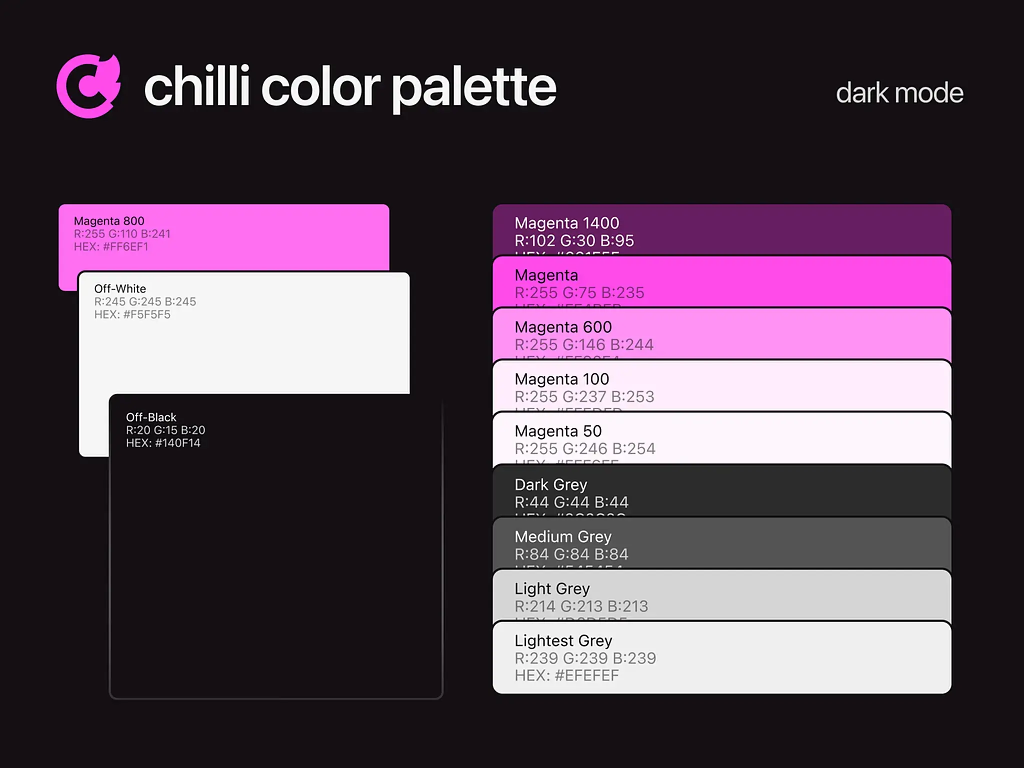
We started from chilli's main colour, a magenta, to build a full palette in dark mode. The contrasts between sections come from this palette. A modern typeface and custom graphic elements carry the brand's committed tone.
2. A page that leads to the download
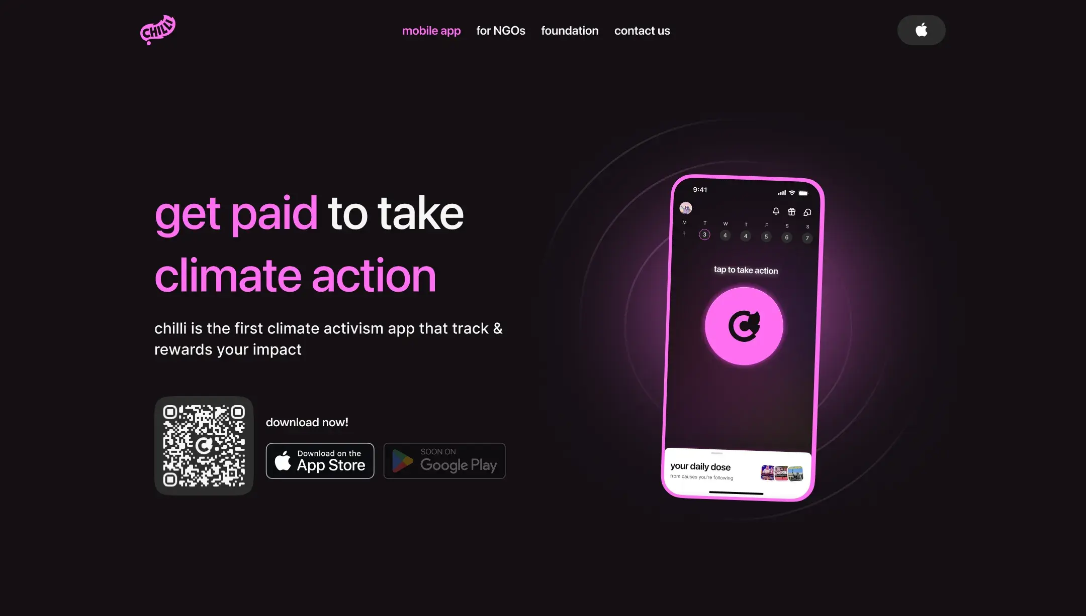
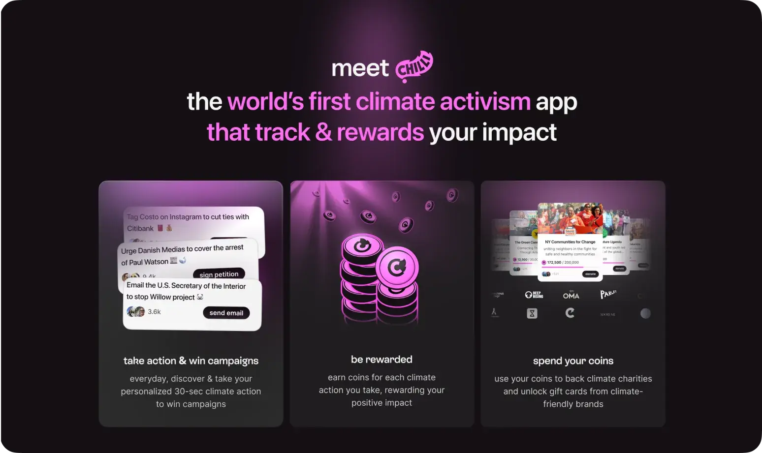
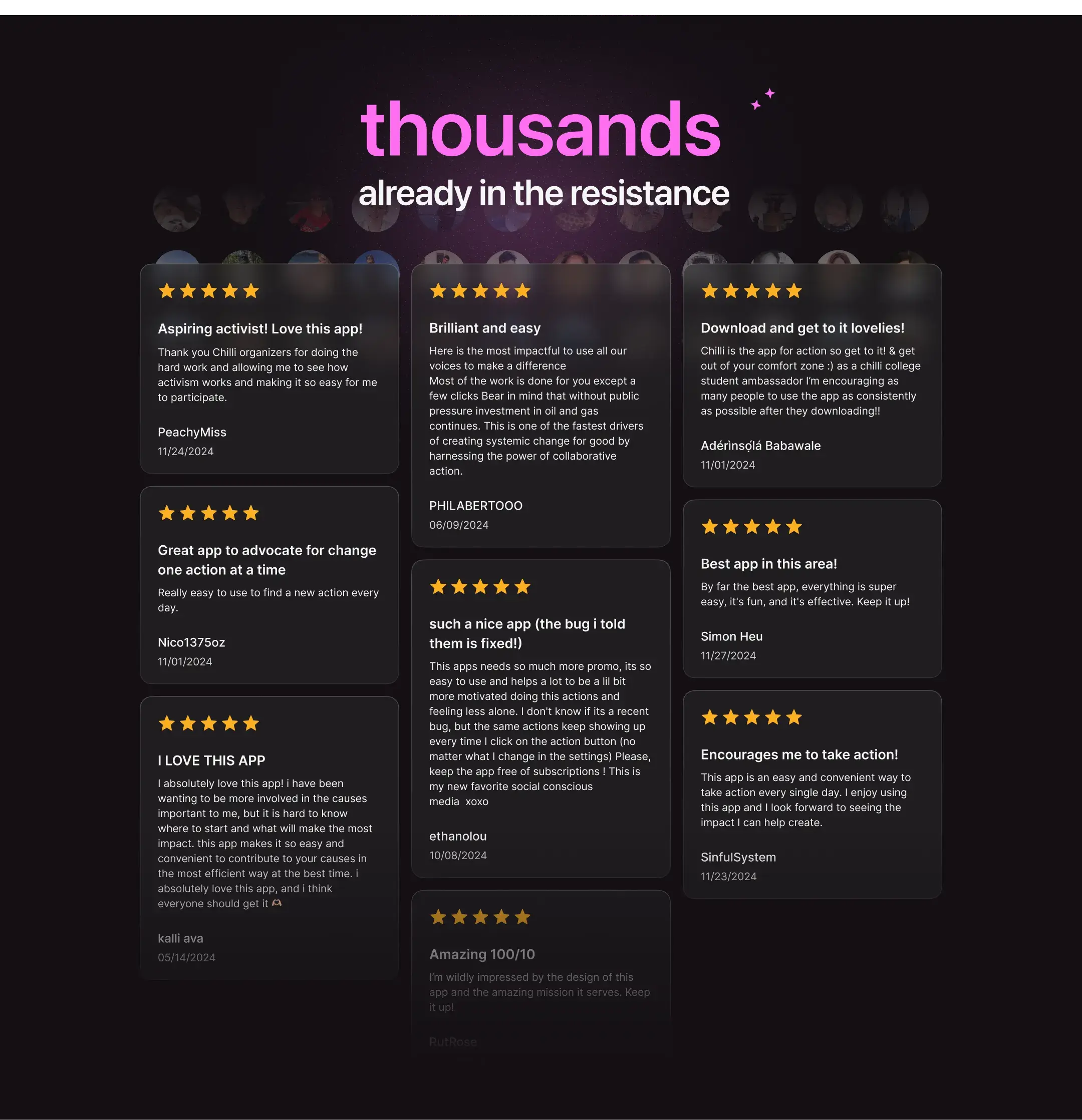
The top of the page states the promise and gives the App Store link straight away. Next comes how the app works, in three steps, then user reviews. Calls to action to the App Store punctuate the page.
3. A Webflow build for every screen
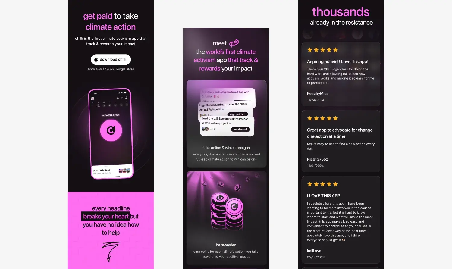
We built the page in Webflow, adapted to mobile, tablet and desktop. For an app, the mobile version matters: visitors download from the phone in their hand.
Results: a page delivered in late 2024, leading to the App Store
- A landing page, delivered, that explained chilli's concept from the first screen.
- Calls to action to the App Store, from the top to the bottom of the page.
- A full palette, drawn from the brand's main colour.
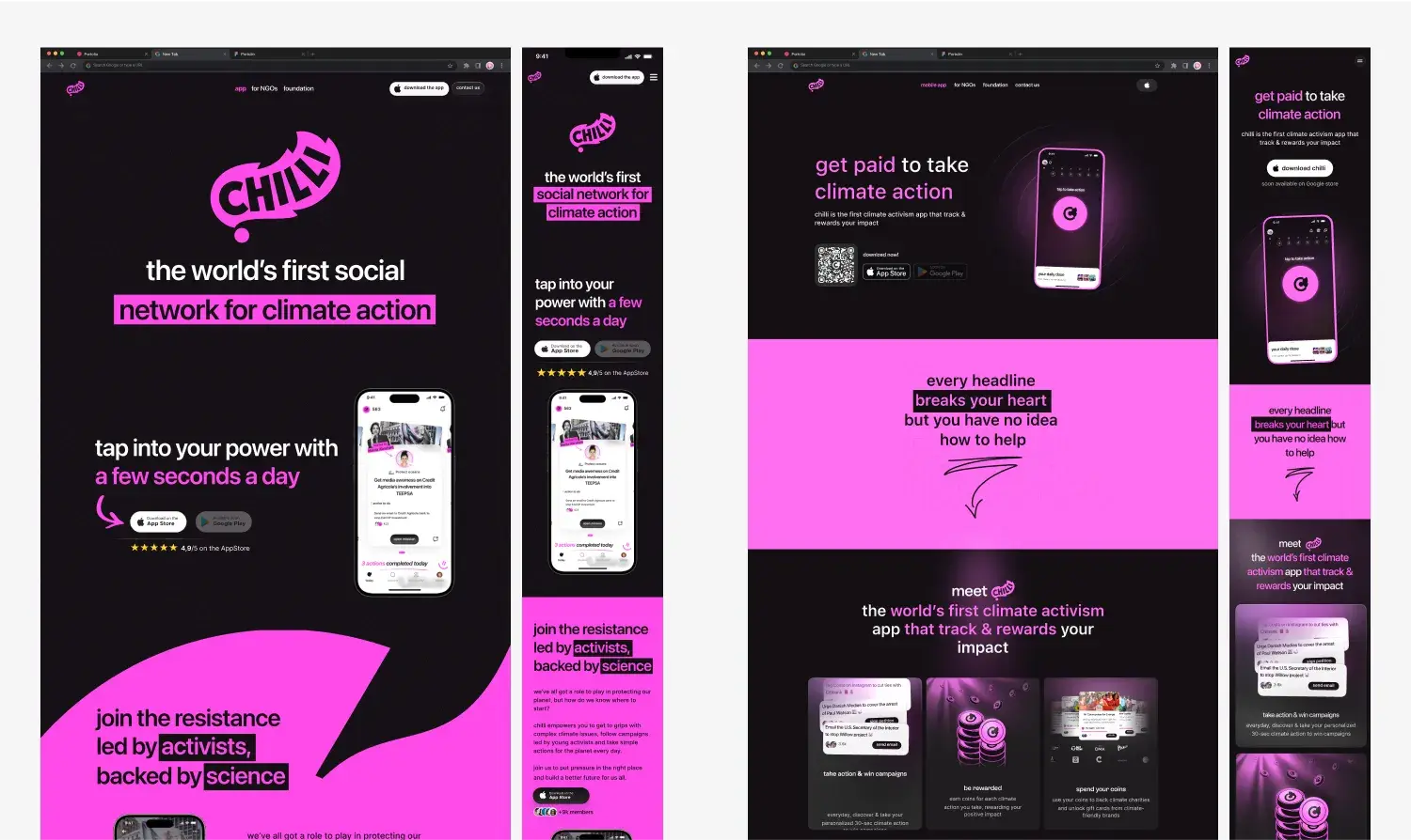
chilli's website has changed since: the screenshots show the page as we delivered it.
Updated on 2/11/2026