- raised before the redesign, after a successful pilot with OUIGO
- $3M
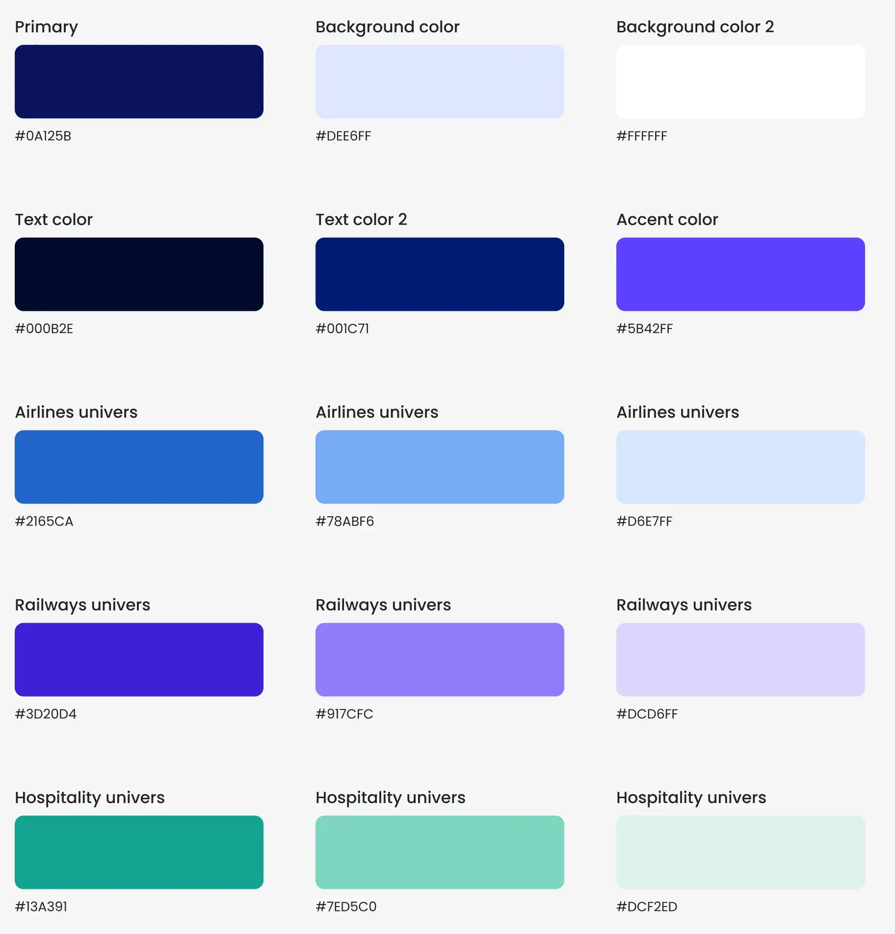
- verticals (airlines, rail, hospitality), each with its own colour
- 3
“The Croissant team was remarkably professional from the first day to the last.”
 Morgan GuérinCMO @ Fairlyne
Context: a $3M raise, a website that didn’t show it
In 2024, Fairlyne ran a successful first pilot with OUIGO and raised $3M. The company wanted to mark its press launch with a website to match.
Its website wasn’t keeping up. It spoke to airlines, rail operators and hotels all at once, with no path for each. And its image was out of step with a company that had just won over OUIGO.
Goals: a credible image, a clear message for each audience
The redesign had three goals:
- Structure the site by audience: airlines, rail and hospitality.
- Guide every visitor to the content that matters to them, in a few clicks.
- Give Fairlyne the image of a major SaaS, with an identity of its own.
How we did it: from architecture to launch
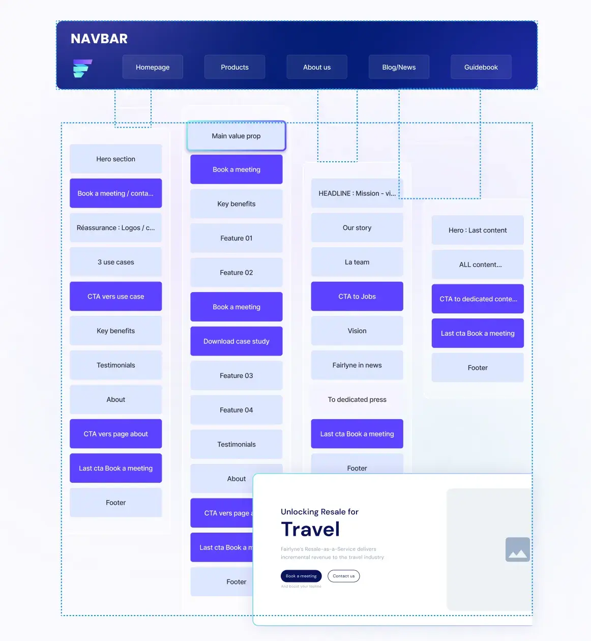
1. Navigation by audience
We started with a workshop with the team. The aim: a navigation where each audience quickly finds its way in. The sitemap brings out the pages that matter: products, news, blog and guides.
2. Wireframes to validate the paths
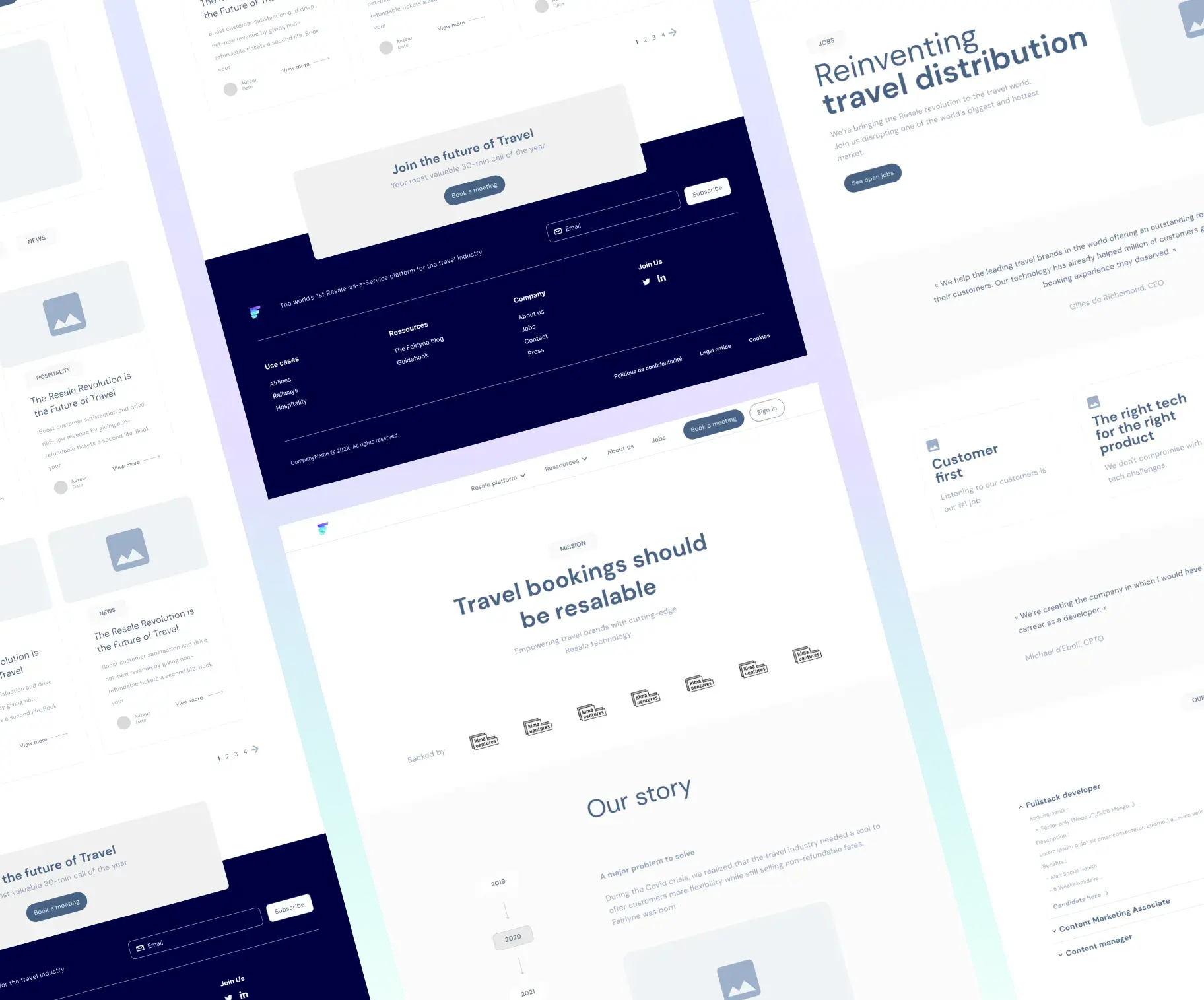
Before the design, we laid out every page as a wireframe. The team validated the order of content and the paths, without being distracted by colours.
3. An identity with one colour per world
We created a complete style guide: typefaces, a main palette, then one colour per world. Blue for airlines, purple for rail, green for hospitality. Visitors know at once which world they are in.
4. Components designed for Fairlyne
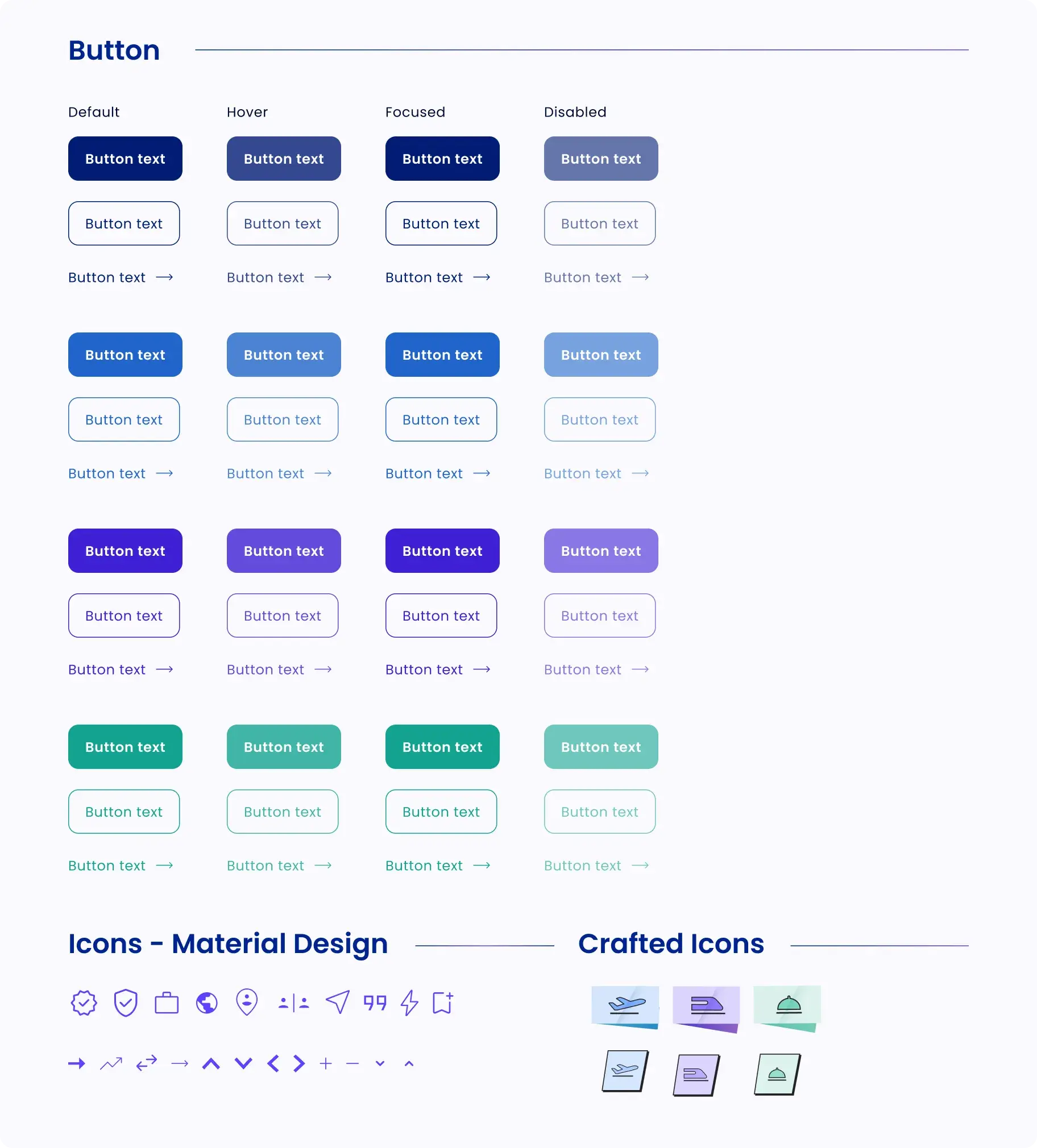
We designed the site’s components: buttons and their states, icons drawn for each world. They give the site its signature and stay consistent from page to page.
5. Desktop and mobile mockups, then the WordPress build
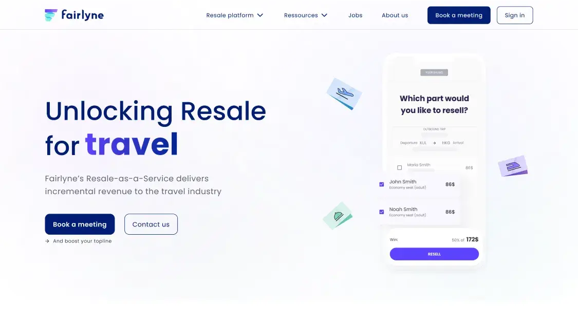
We designed mockups for the site’s ten or so pages, on desktop and mobile. Then we built the site on WordPress.
Results: a complete identity, a cue for each audience
In three months, from June to August 2024:
- A complete identity: style guide, one colour per vertical, components designed for Fairlyne.
- A path for each audience: airlines, rail and hospitality each have their entry point and colour.
- Ten or so pages designed and built, on desktop and mobile.
In 2026, the Fairlyne website is still organised by world.
Updated on 1/11/2026